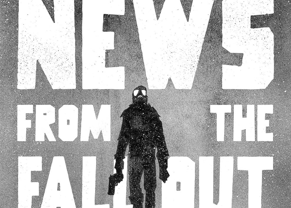
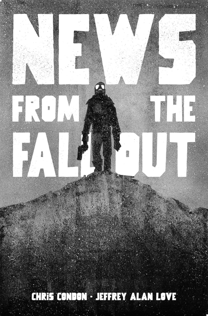
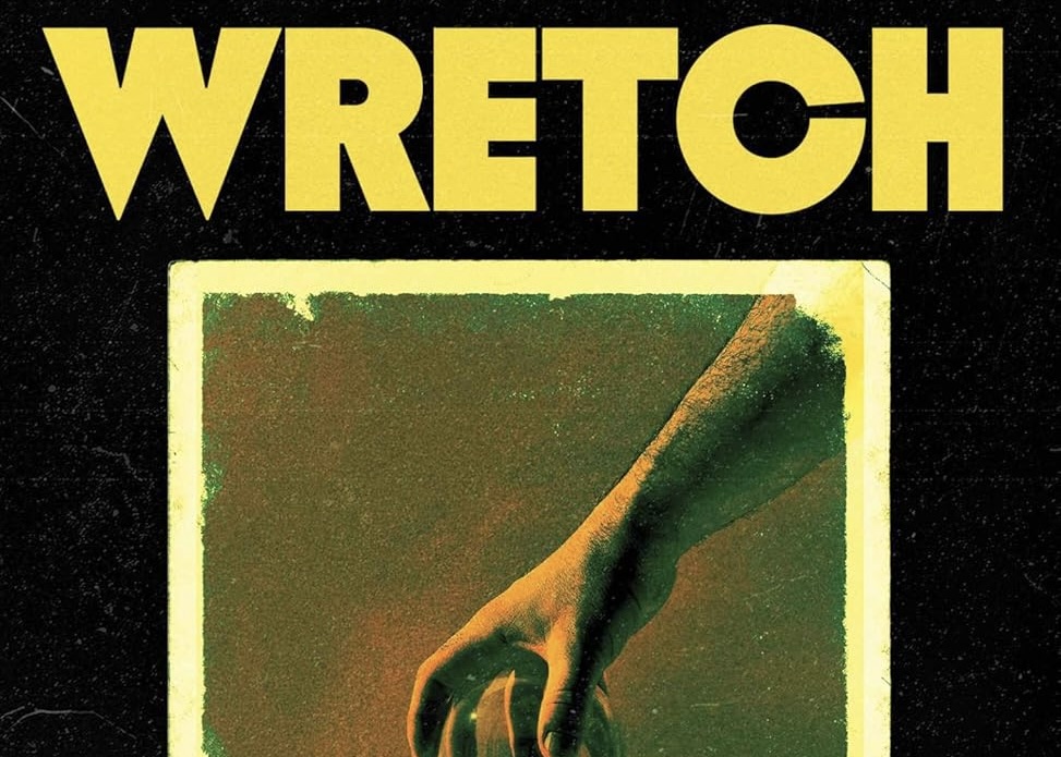
TL;DR: News from the Fallout is post-atomic horror that weaponizes negative space and broadcast rhythm, turning the Nevada desert into a clean, quiet killing field where the sky feels like an accusation. It lands because Love’s stark silhouettes and relentless page-turn pressure make the threat feel both cosmic and procedural, perfect for readers who like their apocalypse elegant, brutal, and fast.

This comic starts like an official lie told through a loudspeaker. A base. A test. A chain of command. Men in helmets arranged like props. And then it immediately does the funniest, cruelest thing a horror comic can do: it makes the sky feel big. Not inspiring big. Indifferent big. The kind of big where your little “yes sir” sounds like a fart in a cathedral.
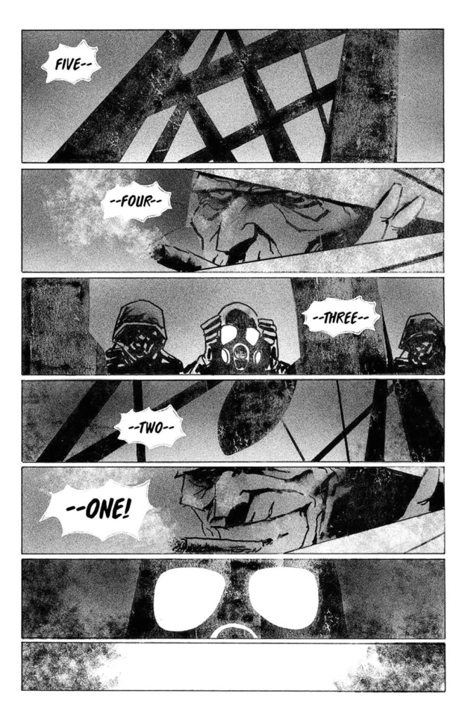
It ramps in clean, mean steps, and it uses the form to do it. First, you get the vibe of procedure and obedience, all hard angles and cramped interiors. Then the siren begins to dominate the page, that “AWOO” smeared across the horizon like a curse you can hear through your teeth. A couple of pages later, it gets even simpler: a countdown broken into thin horizontal strips, five-four-three-two-one, each strip a breath you do not want to take. That’s the book telling you, politely, you are about to watch control fail.
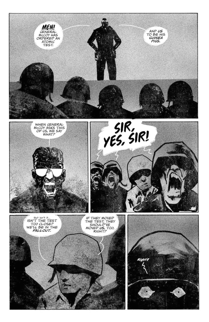
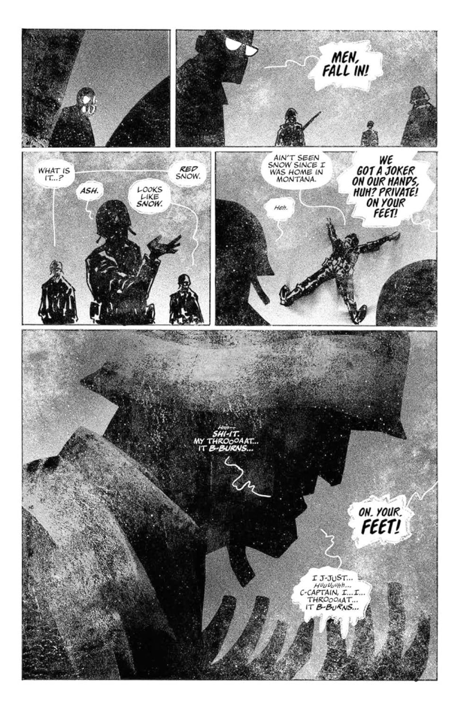
The issue opens at a military site preparing for an atomic test in the Nevada desert. A general basks in the “beauty” of what’s coming while a subordinate, Corporal Finney, gets dragged into a tense, time-stamped day that keeps repeating its pressure. When the test hits, the fallout is not just weather. It’s a doorway. From there it turns into a survival situation where the outside world becomes a white, abrasive threat and the thing hunting them does not care about rank.
Jeffrey Alan Love’s art is basically an argument for silhouettes as terror. Faces are often reduced to slabs of shadow with bright, blank eye shapes. Gas masks become cartoonish and holy at the same time, those round filters like they could be mouths, or eyes, or neither. The ink and texture choices matter here because the page is never clean. Everything looks dusted with grit, like the comic itself is contaminated. Even when a panel is mostly empty sky, it’s a sky full of noise. That grain becomes dread. You cannot rest your eyes.
Paneling and pacing are doing a lot of heavy lifting, and it’s not flashy. This book loves a steady grid until it doesn’t. In the early base scenes, the panels keep you locked in routine: orders, reactions, small movements, authority pressing down. Then it starts breaking that rhythm with wide horizontal landscapes that force you to scan, the kind of panels that feel like standing on a ridge and realizing you’re visible for miles. Page turns are used like trap doors. You flip from a controlled interior to a wide exterior where the siren text stretches across the horizon, and suddenly the “safe” space feels like a joke. There are also these great silent beats where the dialogue thins out and you’re left with body language, posture, and the direction people are staring. Those pauses are not calm. They’re suspenseful. The comic knows silence is a sound effect.
Readability and staging stay impressively clear given how stylized the figures are. Action is legible because Love keeps the silhouettes distinct and the spatial relationships simple. When a figure runs, you can feel the panic in the angle of the body, the reach of an arm, the way legs are drawn as urgent slashes. When someone hesitates, it’s a stopped shape in a world that’s still moving. Facial acting is minimalist but effective. The eyes, when we get them, read as terror or disbelief, not generic “spooky.” And when the threat appears, it is staged so you always understand distance, even if you don’t fully understand what the thing is. That matters. Confusion kills horror faster than gore.
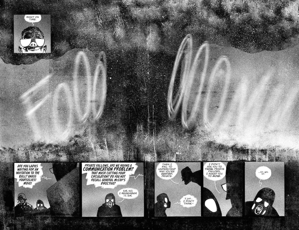
Lettering is sharp, and it shapes how the book “sounds.” The balloons are not overstuffed, which keeps the pace snapping forward instead of drowning in exposition. When someone says “sir,” it feels clipped and practiced, like a reflex. When someone drops a “what the fuck,” it lands because the page has earned it. The sound effects are integrated as part of the atmosphere rather than just impact labels. That siren howl is huge and smeared. Later, you get scratchy, harsh SFX that feel like sandpaper on your eardrums. It’s not cute. It’s abrasive in the right way, like the book is trying to make you physically uncomfortable.
Color choices are limited, and that restraint is a weapon. The book is grayscale with heavy texture, letting negative space and contrast do the mood work. When color shows up, it’s not to make things pretty, it’s to stain the scene, to suggest heat, blood, warning, fallout. The palette keeps everything feeling cold, even when the subject is fire. That contradiction is unsettling. The world is burning, but it still looks like winter.
The horror is more about withholding than spectacle. The violence, when it hits, tends to come in clean beats, not long indulgent sequences. You often see the approach, then a sudden intrusion into the frame, then an aftermath panel that lets your brain fill in what just happened. That’s smart, because Love’s shapes are already nightmare-simple. If you overexplain the monster, you make it less scary. The book keeps the threat half-seen, half-understood, and that ambiguity makes every wide panel feel dangerous. You’re constantly scanning the horizon for a shape that does not belong.
Systems fail, then nature becomes a predator. The comic starts with hierarchy and procedure and a belief that the world is controllable if you follow the plan. Then it introduces repetition and disruption, those “it’s Tuesday” beats and the feeling of time looping or stuttering, and suddenly you’re not sure what counts as normal. Once the fallout arrives, visibility becomes the enemy. The open desert is too open. The white sky and ash-snow texture make it feel like you’re trapped inside a shaken snow globe filled with poison. The tension escalates because the environment itself erases certainty, and the comic keeps giving you long, low panels where anything could be coming from anywhere.
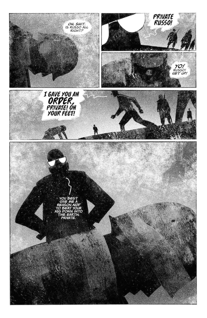
Underneath the scares, it’s about arrogance and exposure. About how power loves its own spectacle, and how quickly that spectacle becomes a mass grave when the universe answers back. It’s also about the horror of being reduced. A soldier becomes a dot on a landscape. A command becomes noise in the wind. A human voice becomes just another sound effect swallowed by the environment. That’s the bleak poetry here, and it hits without needing a monologue.
If I’m taking a knife to anything, it’s that this is vibe-forward and minimalist by design. If you want lots of explanation, lots of character backstory, lots of “here’s exactly what the monster is and why,” you might leave hungry. The trade is that the comic stays fast, brutal, and visually unforgettable. Readers who love stark, poster-like horror art, apocalypse dread, and stories that trust images over answers are going to eat this shit up.

Read if you want apocalypse horror that feels like a minimalist doom poster that somehow still punches you in the throat.
Skip if you need deep backstory, rich character interiority, and long emotional conversations to care.
Written by Chris Condon; Art by Jeffrey Alan Love;
Letters by Hassan Otsmane-Elhaou; Design by Michael Tivey.
Published March 31, 2026 by Image Comics.

Leave a comment